Quick Summary
- Home page targets prospective students
- News page now mobile-responsive
- All work done in-house
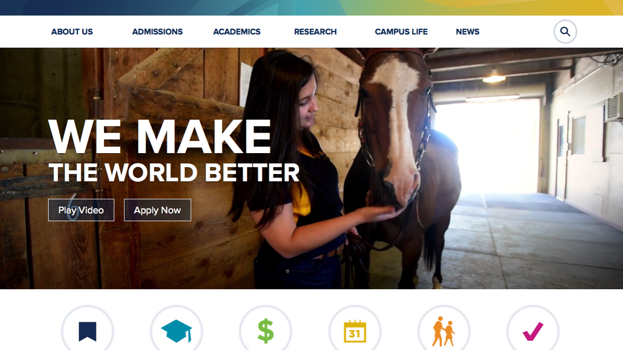
UC Davis has a new look on the Web today! We’ve got a redesigned home page that better showcases the university’s strengths and student experience, and provides easier navigation to research and other university news. The same themes carry over to dozens of new pages “under“ the home page.
“We’re proud to unveil this modern, easy-to-use website that provides all the information prospective students are seeking, while including compelling content for our many other important audiences,” said Dana Topousis, interim lead of Strategic Communications and executive director of news and media relations.
The redesign, the first since 2011, extends to pages with information on admissions, educational programs and campus life — as well as the News & Information page, where research news is now combined with university news (from Dateline UC Davis, for example). All pages have responsive design, for optimum display on all devices.
Prospective students comprise the home page’s largest audience, so much of the content there is geared toward them. But staff, faculty and others may also be interested in campus “Hot Spots,” “Fun Facts” and social media headlines, or the ambient video playing across the top of the page. In addition, the news page is accessible from the top of the home page (and every other page).
Staff from Strategic Communications, Information and Educational Technology, Undergraduate Admissions and Student Affairs Marketing and Communications worked on the redesign for 18 months, with assistance from many other departments. All of the work was done in-house.
Designs backed up by a year of research
How did the staff know how the website would be used? They listened to prospective and current students (and their parents) and watched students as they used the old site, to see how they navigated.
Take a test drive
Here are several pages that show off the website's new look:
Students also spoke about their priorities in choosing where to go to college. Web Editor Susanne Rockwell recalled listening to one student explain that she wanted to find out whether she could play tennis and join a chapter of the Society of Women Engineers at UC Davis. The answers to both questions were “yes,” but those answers were hard to find. Now information on student sports and clubs is more readily available.
The redesign team analyzed data from the old site for trends and to learn what was popular — and what was not. The team also looked at other universities’ websites, and sites like The Huffington Post and BuzzFeed.
“We made some more risky design choices because I knew we had research to back it up,” said Tom Watts, lead interactive Web designer, noting that despite the flashy design, some of his favorite parts of the new site are the subtle visual flairs.
News site gets major face lift
There’s more to the redesigned website than information for prospective students.
“We see the News & Information page as being very useful for faculty and staff, as well as outside media,” Rockwell said.
Five stories are now prominently displayed at the top, and videos and images are better integrated into the content. You’ll also see “UC Davis In the News,” where we will showcase how UC Davis is being featured in outside media.
You can browse through an index of “Latest News,” or filter your way to “University News” or any of a number of other categories, including “Student Life” and various research categories.
With every story you click open, you’ll see a couple of indexes, one for related stories and the other for the UC Davis news site’s top stories; and a UC Davis Facebook feed.
A ‘constant evolution’
The redesigned website is just the first step in a “constant evolution” focused on making the site better for every audience, said Adam Napolitan, Strategic Communications’ interim co-director of Web and interactive communications and lead information architect and search engine specialist.
“This is just a foundation for us,” he said.
Now, when the site gets new features, they’ll trickle down to the admissions, visit, news and other pages that were part of this redesign.
Napolitan said the team plans to add features and information aimed at prospective graduate students next.
Explore the new site at ucdavis.edu. Feedback is welcome, by email to redesign-feedback@ucdavis.edu.
